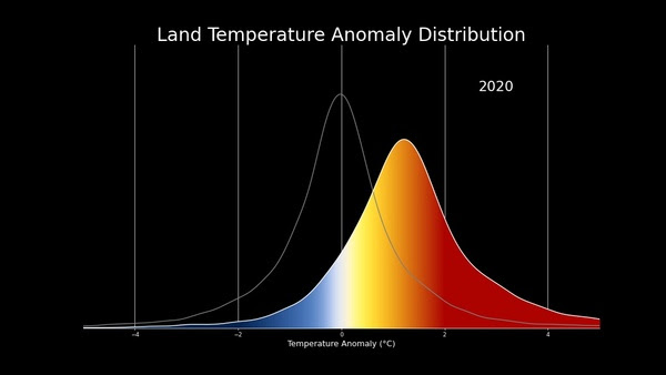
美國航空暨太空總署(NASA)於2021年4月釋出一部影片(Shifting Distribution of Land Temperature Anomalies, 1951-2020),顯示1951-2020年地表均溫的變化。這影片可以看到自1951年以來,隨著陸地溫度的升高,更熱的日子變得愈來愈普遍,而更冷的日子則變得愈來愈少。
This visualization shows that as land temperatures have increased since 1950, hotter days have become more common and colder days have become less common.
當鐘形曲線變短時,人們可以看到更多的數據向右移動,表示日子更熱。
When the bell curve becomes shorter, one can see more data trending toward the right, revealing hotter days.
請看NASA發布的影片,地球70年來是愈來愈熱的。而以後是否要繼續這樣的趨勢,就看你我怎樣的態度與採取怎樣的行動以挽救瀕臨不可回復的地球環境:
1951-2020地表溫度差異變化分布圖(The change in the distribution of land temperature anomalies over the years 1951 to 2020)Credit: NASA’s Scientific Visualization Studio
隨著地球變暖,我們看到分布的峰值向右移動。 溫度分布也變寬。 這種擴大很可能是區域變暖的差異,而不是任何特定地點的溫度變化增加。
As the planet has warmed, we see the peak of the distribution shifting to the right. The distribution of temperatures broadens as well. This broadening is most likely due to differential regional warming rather than increased temperature variability at any given location.
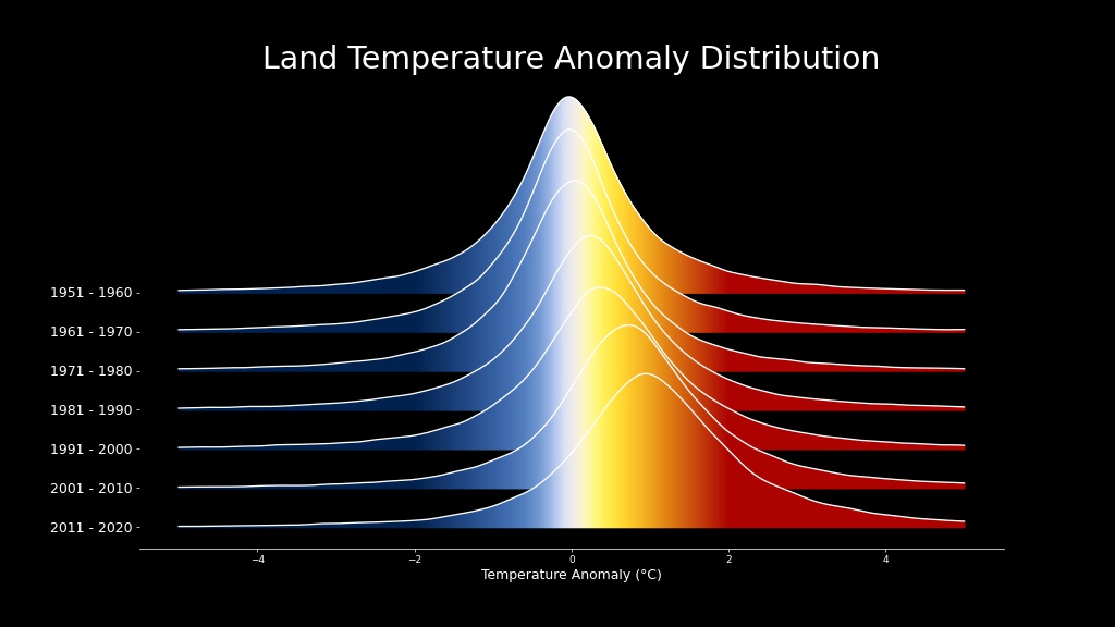 70年間地表溫差分布變化(每10年一個間格)的脊線圖 (A ridgeline plot showing how the land temperature anomaly distribution has changed over seven decades) Credit: NASA’s Scientific Visualization Studio
延伸閱讀:
2020年氣候統計及30秒看地球141年逐漸發燒狀況(影片、圖片、數據)