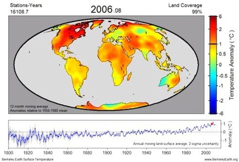
一個位在美國加州柏克萊,由統計學家、物理學家、氣候專家及各類專家組成,專門解析龐大資料瞭解氣候變遷各種因素的獨立研究機構「柏克萊地表溫度研究室」(Berkeley Earth Surface Temperature) ,於日前從15個資料庫中的16億筆200年來地球各地氣溫紀錄整合成2分11秒的影片,可以明顯看出地表溫度在200年間的上下變化。在1900年代,地表溫度顏色開始比較多黃色(比地表平均溫度+0.5℃),1920年代紅色(比地表平均溫度+2℃以上)開始增多,而1980年後地表急遽增溫,橘至紅色區塊居多,地球明顯發燒。
唯有人人恢復傳統節儉美德,不隨意消費,不浪費自然資源與能源,簡化生活需求,處處力行環保,才有可能讓地球降燒,人類與萬物得以繼續生活在美麗的藍色星球上。做得到嗎?至少先從您我開始!
此影片較佳畫質且畫面較大的MP4版可於https://www.berkeleyearth.org/movies.php下載,有利環境教育用。
200 Years Worth of Temperature Data Compiled in One Alarming Video
 Berkeley Earth/Video screen capture
Last week, we reported on the results of the Berkeley Earth Surface Temperature (BEST) study, and they were, well, convincing. Not only did researchers confirm the accuracy of historical temperature records across the globe, it reinforced its anthropogenic origin. And, to further highlight their findings, BEST researchers compiled thousands of data sets on temperature anomalies over the course of two centuries into one alarming video of a warming world.
The video above visualizes surface temperature records dating back to 1800, combining around 1.6 billion temperature reports from 15 preexisting data archives. According to BEST, one of the main objectives of unifying historical data was to “resolve current criticism of the former temperature analyses, and to prepare an open record that will allow rapid response to further criticism or suggestions.”
Berkeley Earth has published their merged data set online, along with other alarming charts and graphs that highlight their findings.
Despite the sheer volume of temperature records used to make this video timeline and the complexness of BEST’s undertaking to gather the data, it is perhaps one of the most succinct and alarming representations of the measurable impact of climate change over time.
延伸閱讀:
您若喜歡本篇文圖,歡迎在文章末按「讚」,協助推廣。


太精采了,地球各地溫度都可以看出變化。